
Kendo UI for Vue
Vue RangeSlider
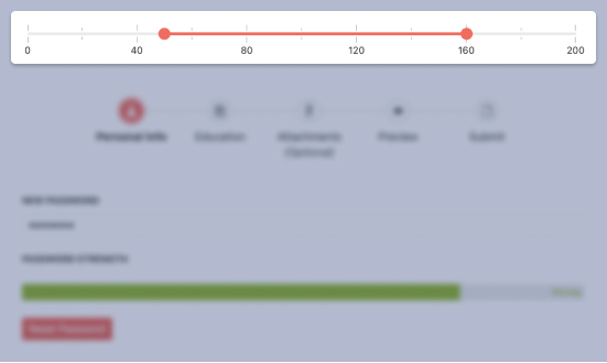
- The Vue RangeSlider gives users and interactive way to set ranges by dragging min and max handles along a track.
- Part of the Kendo UI for Vue library along with 110+ professionally-designed components.
- Includes support, documentation, demos, virtual classrooms, learning resources and more!
-
Overview
The Vue RangeSlider provides an interactive alternative to text fields and spinners. It is a visual input element in which users drag handles along a track to set ranges.

-
Labels
The Vue RangeSlider allows you to set specific values and their position to display along the track.
See the Vue RangeSlider Labels demo
-
Orientation
The Vue RangeSlider renders horizontally by default, but you can choose to display it vertically.
See the Vue RangeSlider Orientation demo
-
Controlled Mode
By default, the Vue RangeSlider is in an uncontrolled state, which means the user has control over it. You can manage the state by setting values and handling onChange events.
See the Vue RangeSlider Controlled Mode demo
-
Disabled RangeSlider
For cases when you would only like to display the slider as read-only, you just need to set the disabled property to true.
See the Vue Disabled RangeSlider demo
-
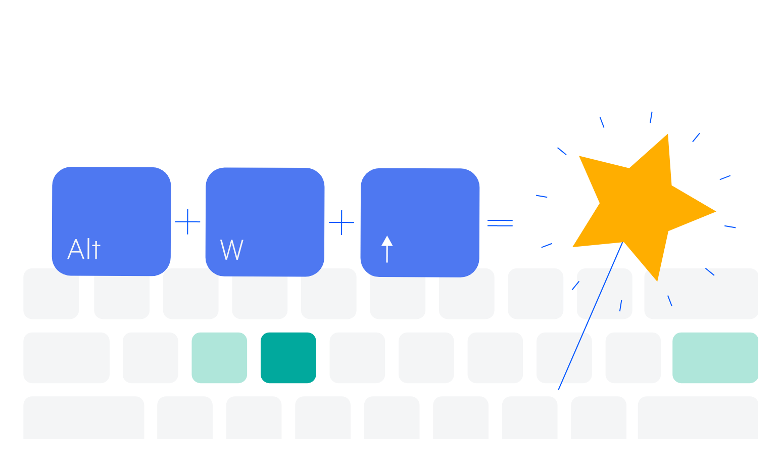
Keyboard Navigation
Like the rest of the components in Kendo UI for Vue, this component includes built-in keyboard shortcuts for all its essential functions.
-
Accessibility
The Kendo UI for Vue team strives for the best accessibility support by complying with WAI-ARIA and Section 508 standards.
Read the Vue RangeSlider Accessibility details


Get Started with Kendo UI for Vue
